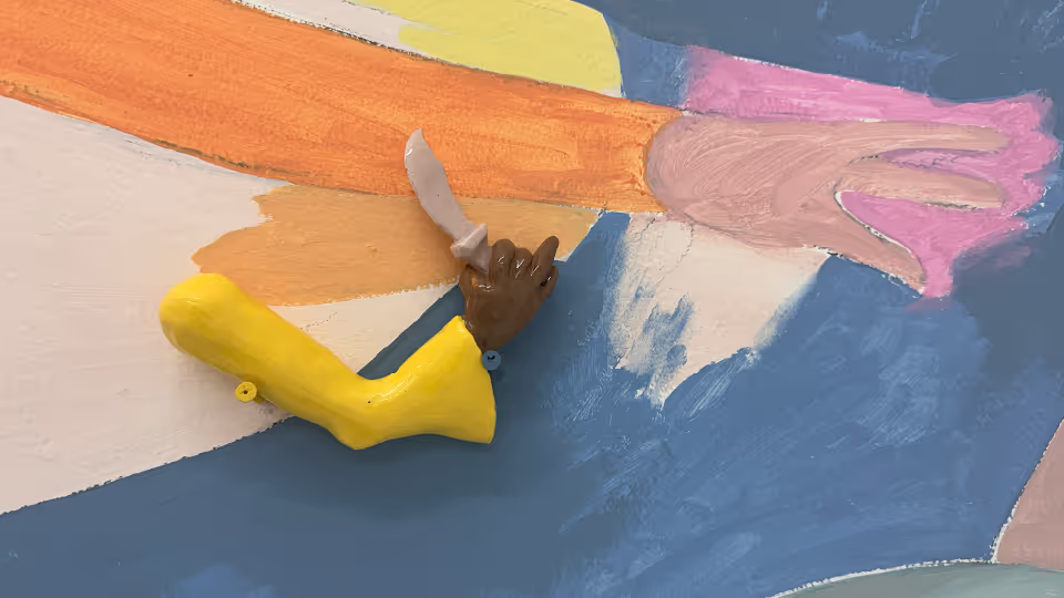


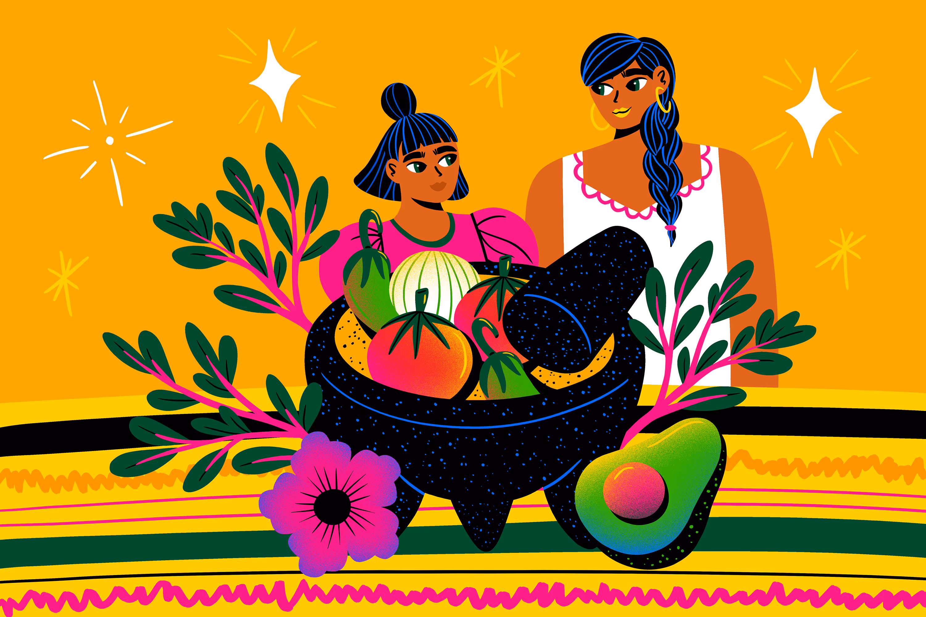
Image: detail from Harvey Nichols x Jacky Blue SS25
Recent consumer backlash to high-profile AI slop holiday campaigns — like Coca-Cola’s glitchy trucks and creepy, dead-eyed townspeople, and McDonald’s tone-deaf and frankly strange “most terrible time of the year” campaign — sends a pretty strong signal that companies that over-invested in AI expecting quick, cheap creative replacement might scale back, realizing that high-quality, complex, and consistent creative work still requires skilled human expertise.
The AI bubble bursting could lead to a slowdown in the aggressive development and deployment of new, expensive, and non-profitable AI tools, giving human artists more time to adapt and integrate existing AI tools effectively into their workflows.
“Creatives will realize that AI is actually a tool to facilitate tasks, from storyboarding to moodboarding ideas,” says Four Four artist Ana K. Hill. “The essence and real feeling is only based on the human touch, connection and that can’t be done by a machine. Brands will have to make a balance so it’s not robotic — the target audience will miss that connection and brands will have to go back to the basics.”
The exact flavor of AI anxiety might depend on who’s in your LinkedIn bubble. The people who have everything to gain from AI-everything are anxious that we’re not using it enough and we better catch up lest we’re left behind, while those who feel like their livelihoods are genuinely threatened range from cautious to catastrophizing. But the one thing that unites all AI-related dialogue, it’s the hyperbolic take.
Messy matters more
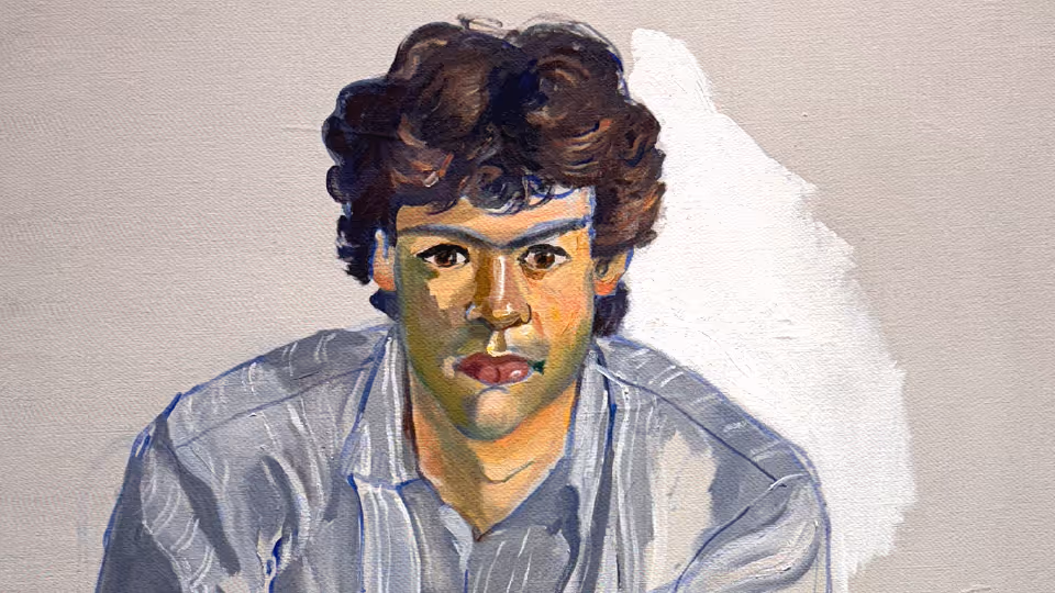
Brands using photorealism are going to struggle to be taken seriously. It’s the art world’s version of a magic trick. You’re meant to stand in front of the canvas and say, “Wait – that’s not a photo?” At its core, it’s about using photographs as source material, then reproducing them in paint, pencil or other media with such obsessive precision that they read as high‑res photography from a distance.
While some amazing photoreal 3D portraits are being made, that appeal seems to have well and truly run its course. Current AI image generators already produce portraits, cityscapes and still lifes with the kind of reflections, depth of field and lens artefacts that were once the preserve of the photorealists. That technical “wow”, the thing that carried a lot of photorealism’s prestige, is now available as a default filter.
To remain differentiated and to regain consumer trust, brands are going to have to rethink their use of photorealistic images — even if they are generated by human artists. Consumers have become wary and weary of the uncanny valley, and the best way for brands to avoid it is through creative with deliberate hand marks — messy matters more.
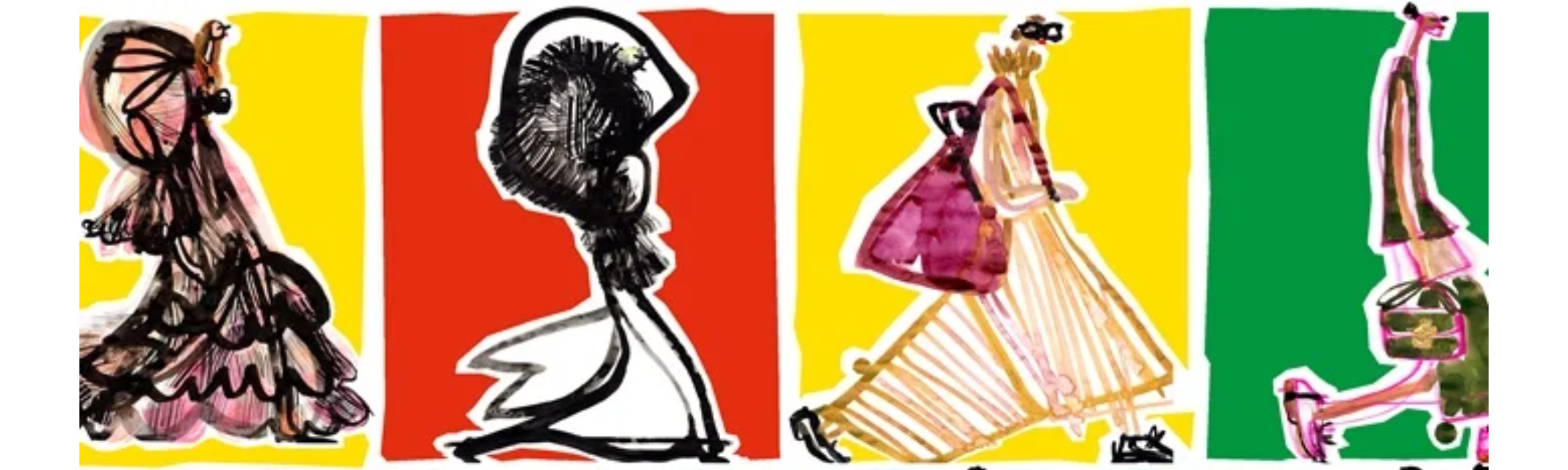
A gorgeous example of this is the energetic watercolor illustrations for Harvey Nichols x Jacky Blue SS25. The campaign is luxury brand marketing at its absolute best and positions Harvey Nichols as a brand that cares about craft and creativity, while differentiating the major retailer as one that thoughtfully chooses to go against hollow trends.
DIY is the new luxury
“Big brands are going to learn from Coca-Cola’s mistake and commission more hand-made art for their campaigns to show they are human-oriented,” says illustrator and designer Olga Davydova.
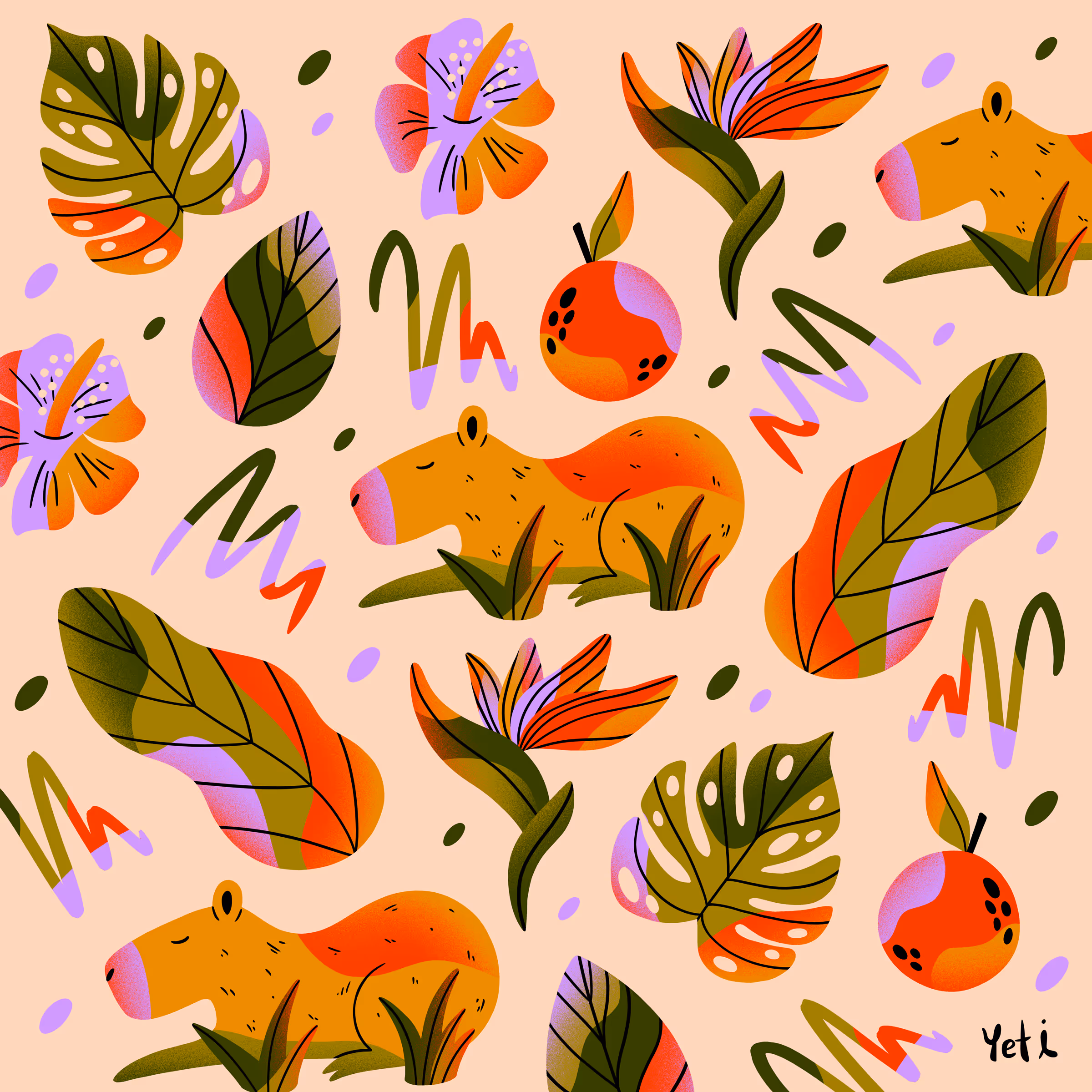
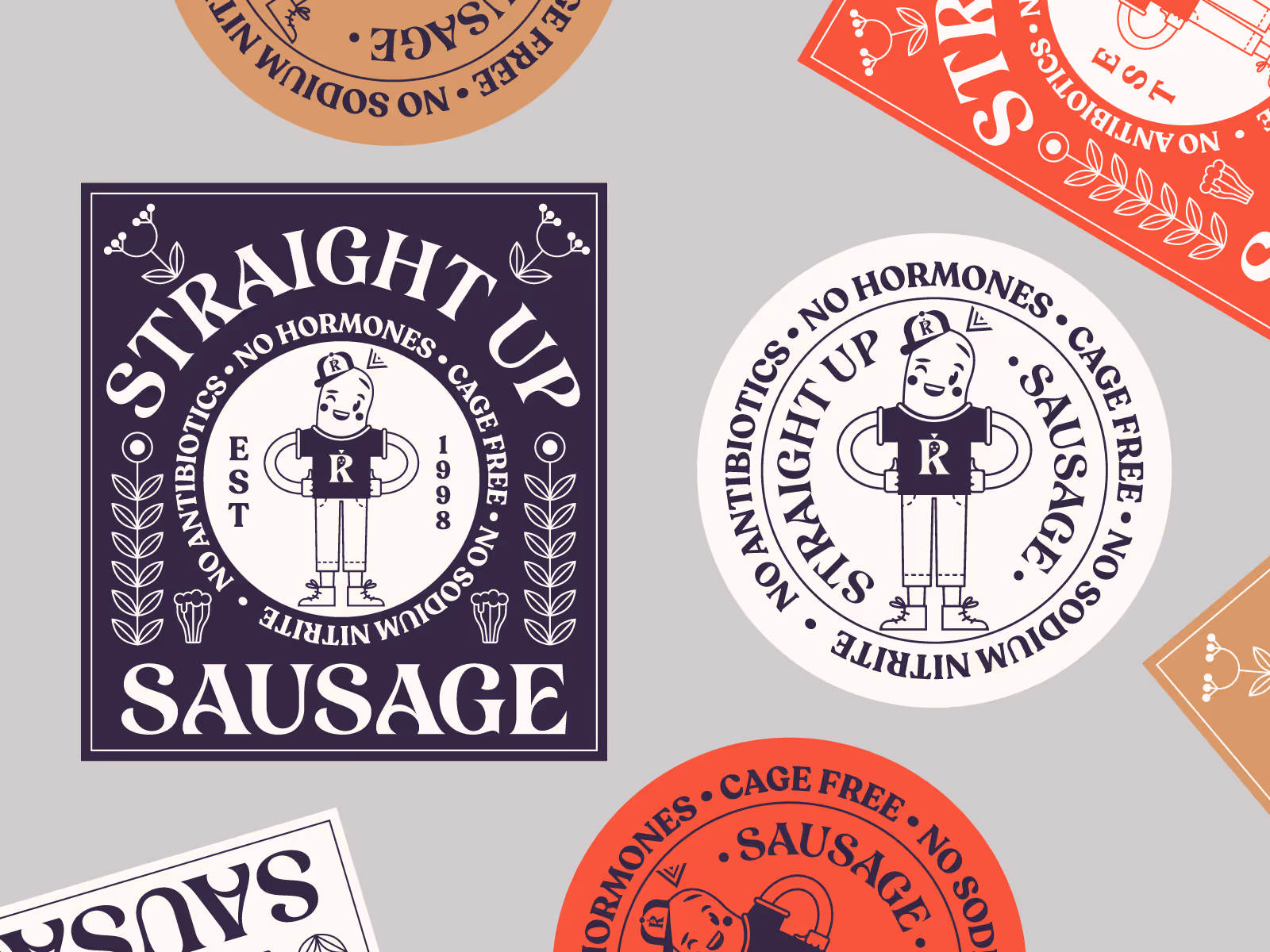
Illustration is such an effective way to create distinctive, tactile assets for a brand, making it instantly recognizable and memorable. A suite of characters, icons or modular assets can flex across OOH, social and motion, giving brands a distinctive, ownable language.
Illustration offers unique advantages. Distinctiveness is the obvious one because, in a sea of photography-led campaigns, a hand-drawn execution can stand out immediately. It stretches ideas and allows you to go where photography can't. You can bend, warp, and exaggerate. Color plays a stronger role, and illustrators can throw colour around in a way that photographers can't.
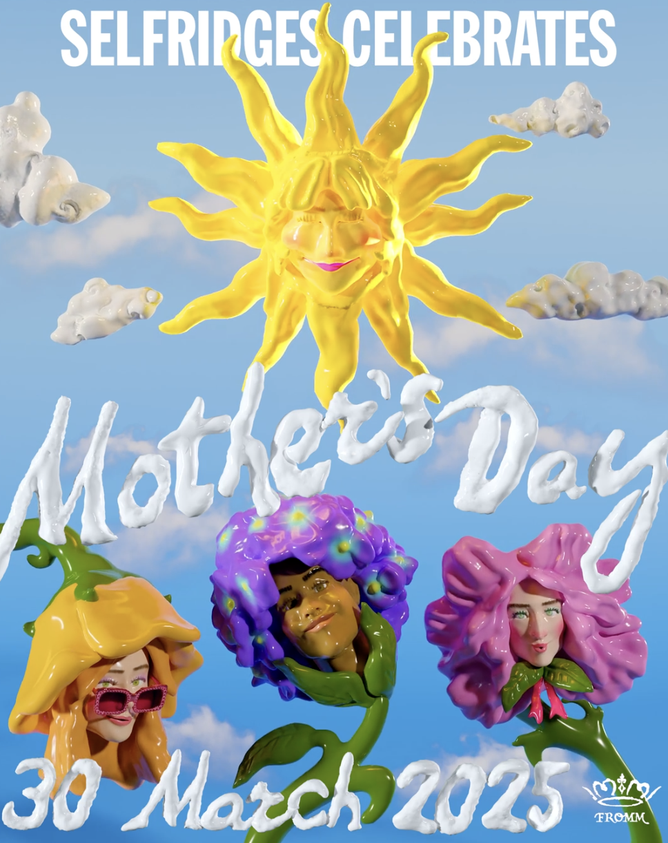
A suite of characters, icons or modular assets can flex to build worlds across OOH, social, websites, packaging, and motion, giving brands a distinctive, ownable language, like Selfridges' recent activations with Fromm Studio. Distinctive illustrations were rolled out across seasonal campaigns, from in-store animations to digital comms. Brands hosting illustration in a luxury setting is exciting for customers – it pushes perception and delightfully surprises people.
As AI and turmoil in the creative industries make it harder to make a living as a digital artist, many are moving into traditional art such as painting and sculpture.
For some it’s a side hustle or backup plan. In uncertain times, artists are creating additional income streams that live alongside their main work as illustrators, concept artists or animators, and these alternative sources of revenue can be grown as needed, should the digital art work dry up. For many it’s a case of going back to first principles, focusing on the core of who they are as a creator, and pivoting to a medium that’s viable as an income source.
Turning down the volume on color
Pantone recently unveiled their color of the year for 2026 and it’s a shade of off-white they’re calling Cloud Dancer. The company has made a bunch of colour palettes with Cloud Dancer in them, and they’re fairly representative of the colour trends we can expect to see going into 2026. Many are a continuation of trends that have been around in fashion this year, and next year, we’re going to see them moving further into other kinds of visual design.
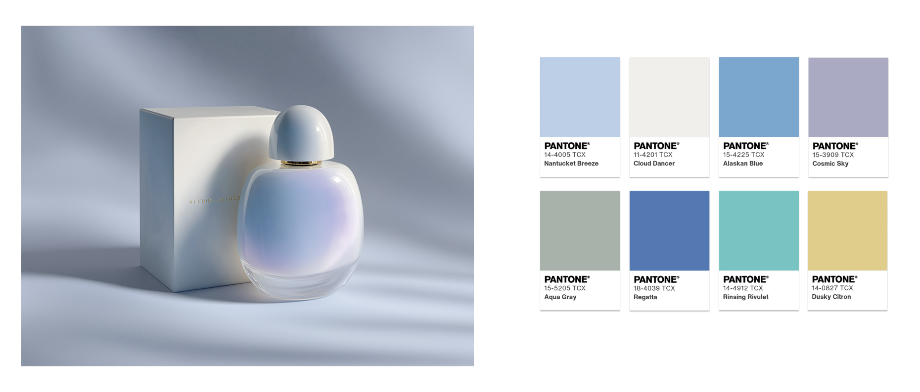
One palette is a selection of desaturated, pastel shades. Another, "Atmospheric", is similar to the so-called Mermaidcore aesthetic that’s based around the shimmery look of light as it’s reflected on water. Then there’s “Comfort Zone” too; this one is made of earthy, natural tones that evoke that sense of authenticity we’re all apparently hankering after. And “Tropic Tonalities” covers the hot pinks and shocking greens.
These choices matter because Pantone is the color standardization company. When they crown a color, brands listen. Fashion designers scramble. Paint companies rush out matching tins. So when Pantone picks white, it's not just a color choice. It's a statement about where we are as a culture. And apparently, where we are is exhausted, overstimulated and desperate for someone to turn down the volume on everything.
So what does all this mean for your brand in 2026?
Simple: the pendulum is swinging back toward craft. Consumers are rejecting AI slop. Photorealism is losing its luster. And illustration — real, human-made, distinctive illustration — is having its moment. Pair that with color palettes that signal authenticity rather than algorithmic perfection, and you've got a recipe for standing out in a sea of sameness. The era of quick-and-cheap creative is ending. The era of intentional, ownable brand identity is just beginning.
Find out how Four Four's exceptional artists can elevate your brand in 2026 — talk to us about your project or idea today